<–click us!
When I moved back to Pittsburgh at the beginning of 2023, I planned on going back to school while working part-time. Dog walking and animal care had always been my go-to when I was between animation jobs. In general, these jobs usually have a fairly lax schedule and the work is always consistent. I prefer working for small companies as opposed to conglomerates like Wag or Rover.
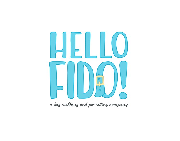
I noticed a theme while I was browsing different local companies. To preface, most animal care businesses are run by a tiny team on a shoestring budget. No expense can be spared on what are considered nonessential purchases. A slick logo and beautiful branding are nonessential.
So I made my own.
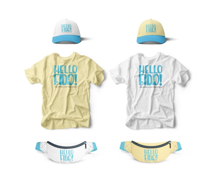
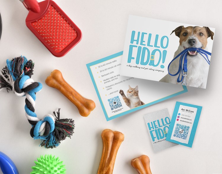
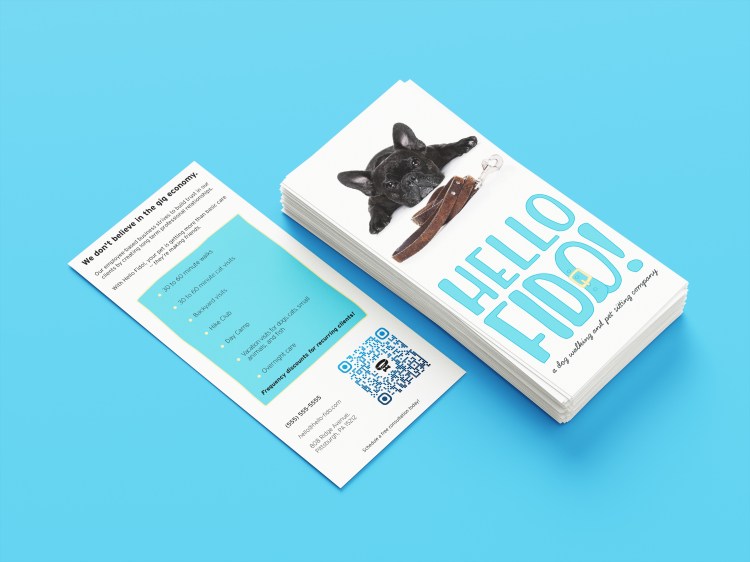
Hello Fido! was created to feel friendly, easygoing, and trustworthy with a soft contrasting palette and handwritten fonts.
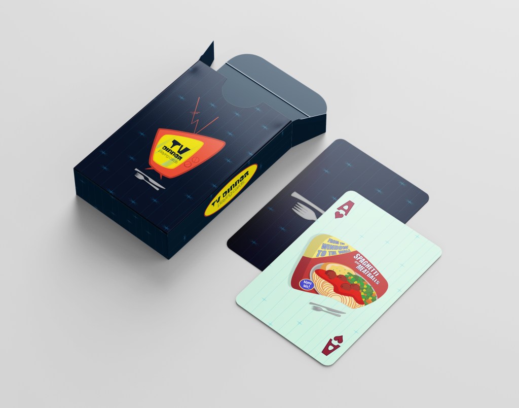
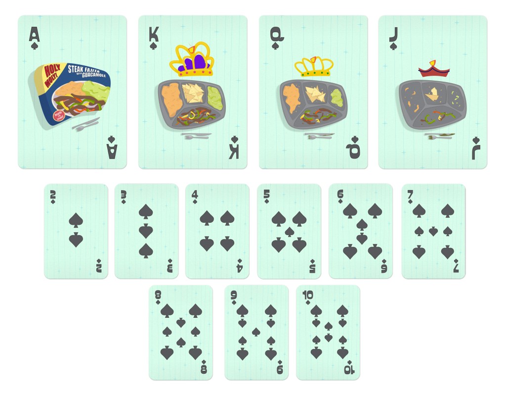
I love how quickly innovation becomes mundane. When the first TV dinner was introduced in the early 1950s, it was a boon to housewives everywhere. What normally took hours to prepare and clean up was boiled down to only popping something into the oven and tossing the tray out when finished.
Now, those same TV dinners are considered to be low-effort and trashy. It’s a meal many would consider to be too immature for an adult to actively want and enjoy.
The early advertising for them is something to behold. The Mid-Century Modern movement was in full swing at that time and the packaging and advertising for these dinners strongly reflect that with their bold contrasting colors and clean lines.
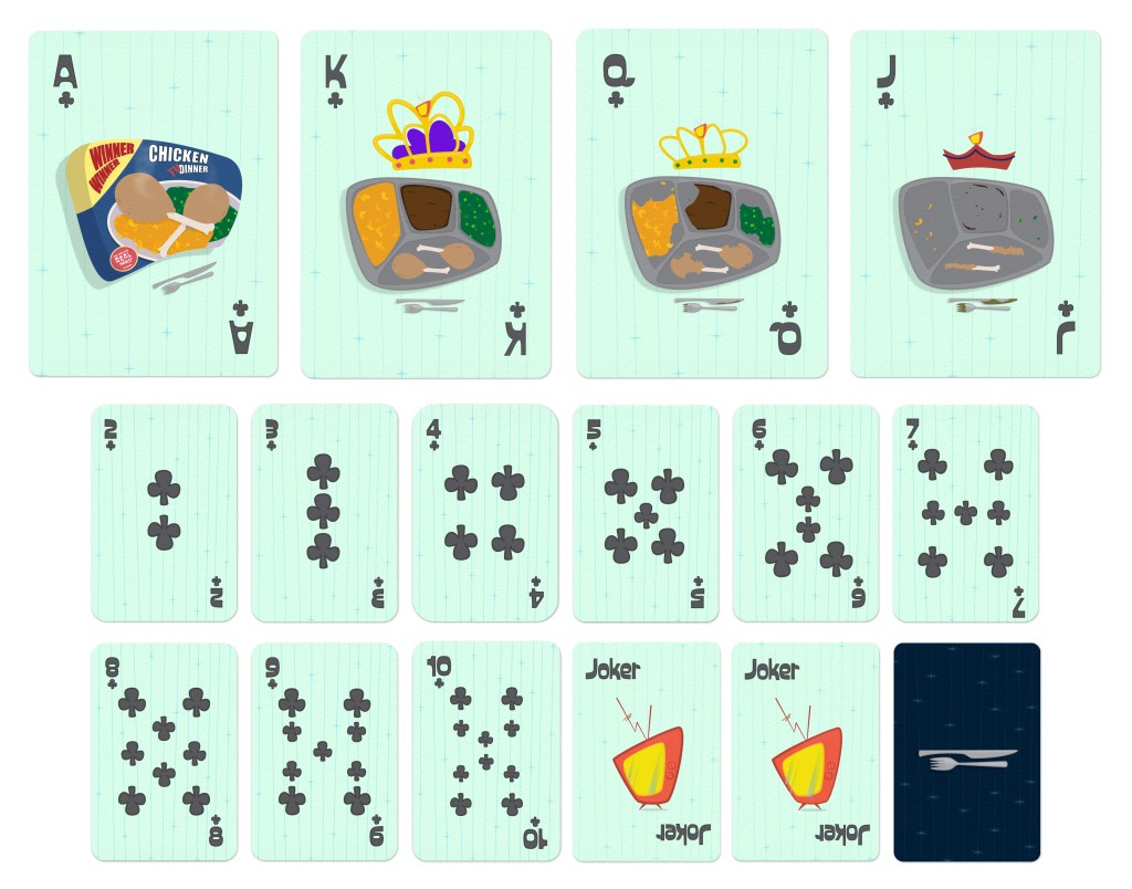
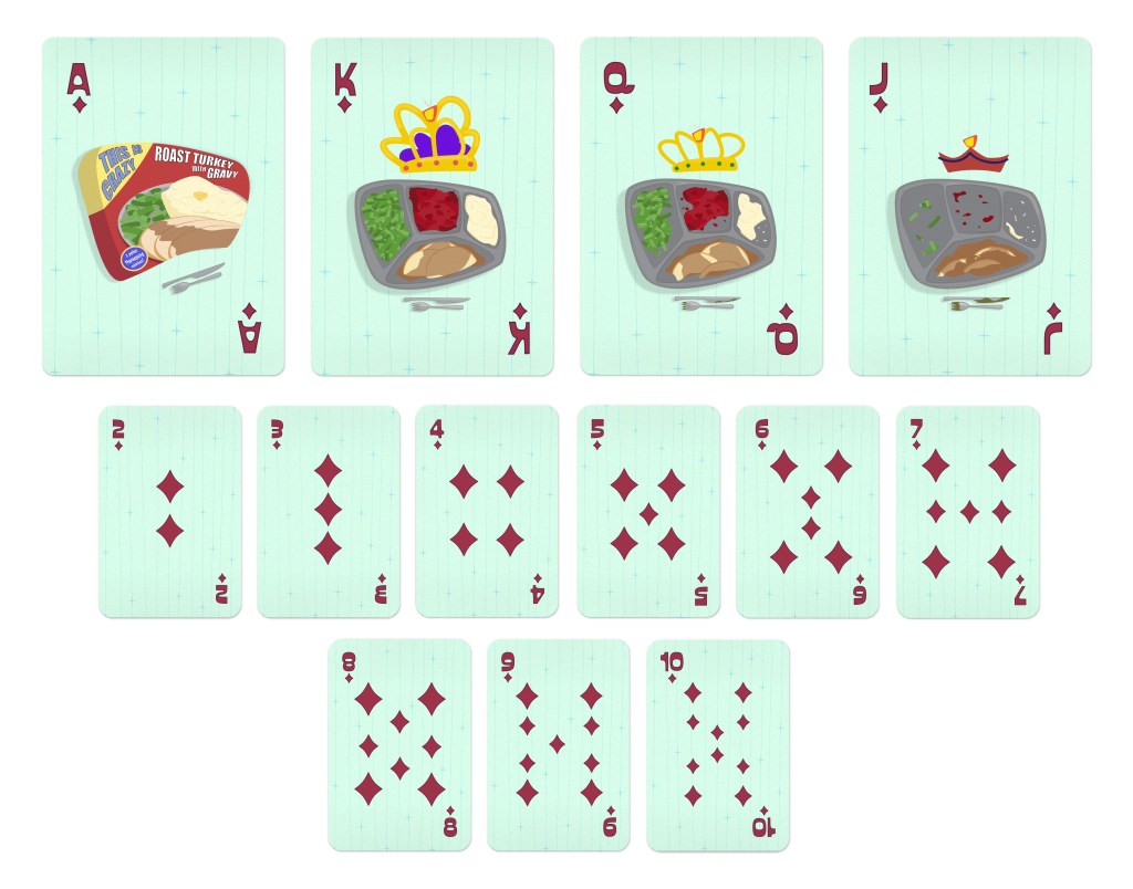
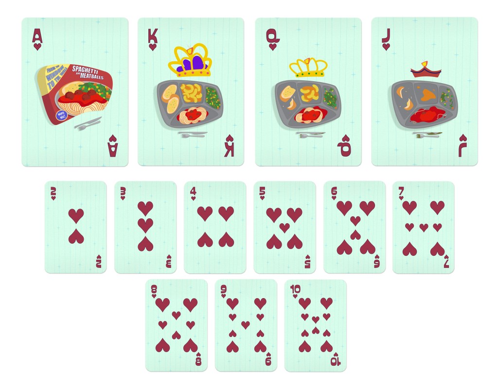
I wanted the playing cards to mirror those themes and give them that 1950s ‘atomic’ feel. Each suit is its own unique meal with a phrase or advertisement on the front.

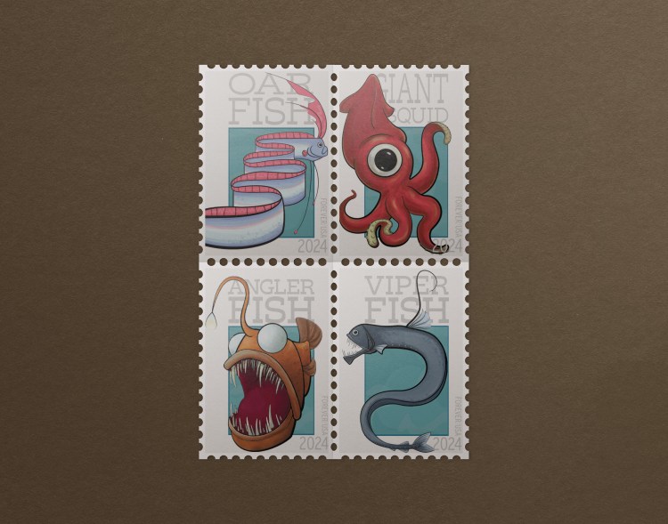
The idea behind the stamps was to draw attention to the deep sea animals that are at risk of extinction due to ocean pollution. A percentage of the proceeds would be donated to an accredited organization dedicated to preserving and cleaning the oceans.
I intentionally selected animals that most consider grotesque, unusual, or horrifying to grab the viewer’s attention.
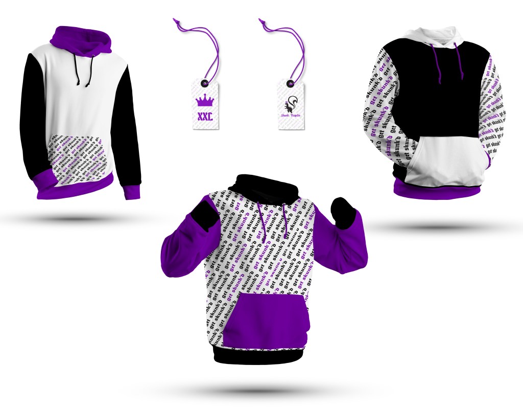
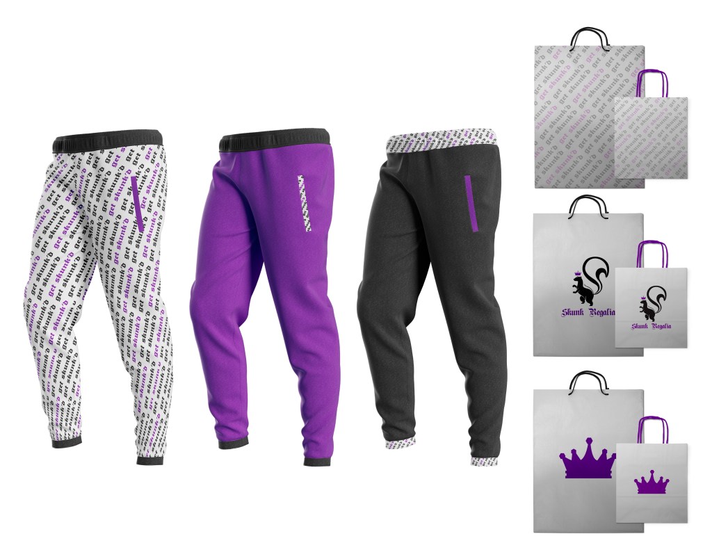
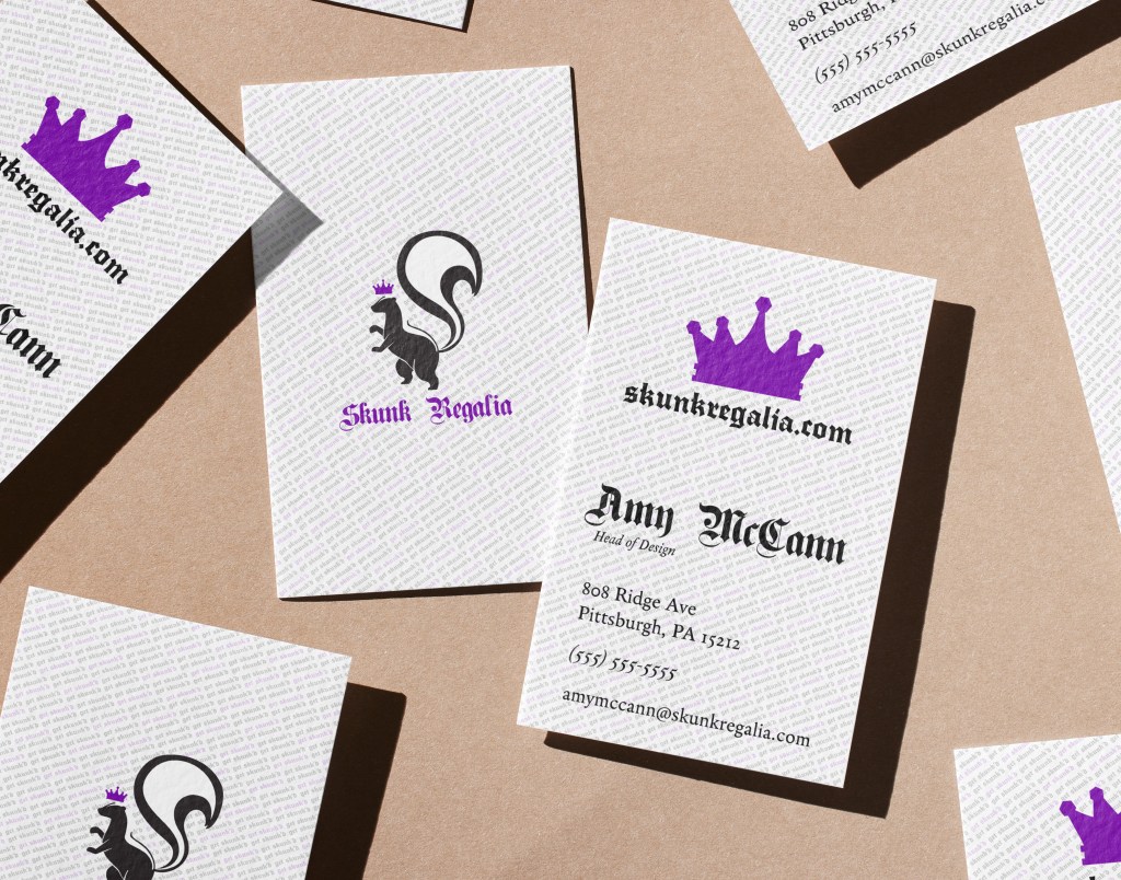
Skunk Regalia is a queer, size-inclusive, hemp clothing company.
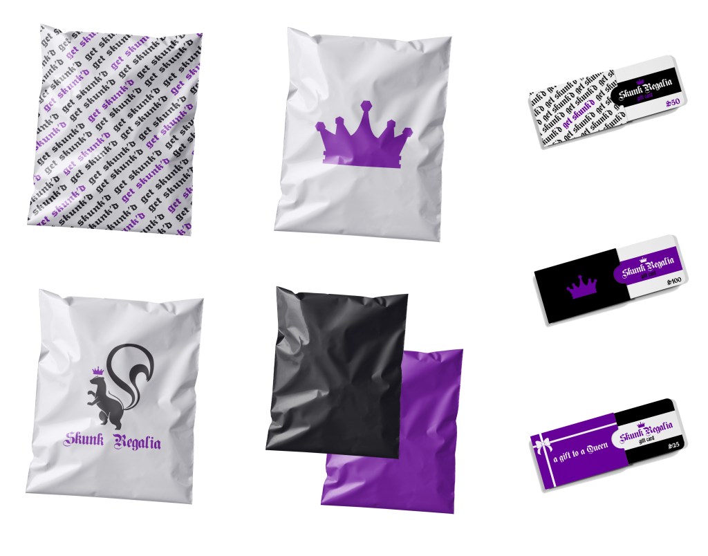
I wanted to have something that nodded towards the clothing fibers and to also have some kind of reference to queer culture. The skunk acts as a double-whammy for this idea. Skunk spray and marijuana smells are (allegedly) easy to confuse with the other. The term skunk can also be used to refer to any cannabis that has a high level of THC.
In queer culture, particularly queer comics, vermin such as skunks, possums, and raccoons are commonly used as a shorthand for LGBTQ+ people (as in, the queer friend group is anthropomorphized as those animals).
The regalia part of the name is to add to the joke-y name. Regalia are emblems or insignia of royalty, like a crown or scepter. The skunk portion of the logo is placed in the same stance that is usually reserved for lions on a crest of arms. Essentially, taking filth and putting it in a place of prominence.
The phrase “get skunked” can have multiple interpretations. It can mean to suffer a great loss, to get high, intoxicated, and so on. I liked the overall vagueness of the phrase and its multiple meanings and thought it played well into the idea of queer culture.
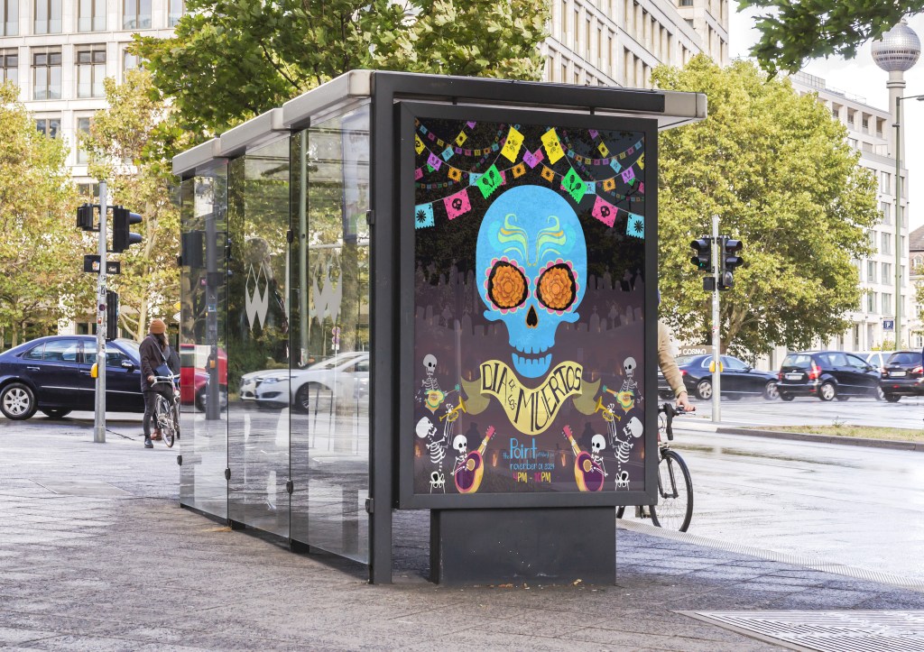
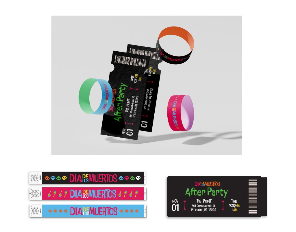
Day of the Dead is ultimately a celebration of life. The overall designs were created to have an enthusiastic and fun feel to play into the idea of a giant party.
The event is to take place at Point State Park, “the Point” to locals, in downtown Pittsburgh. While the main event is free and for all ages, I included a paid after party later in the evening for 21+ people. The wristbands also act as a visual shorthand for age gated areas (pink for under 18, blue for over 18, and black for 21+).


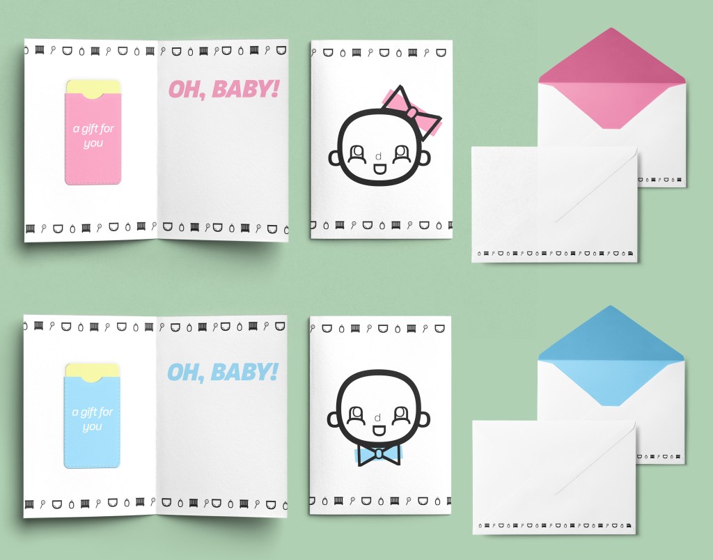
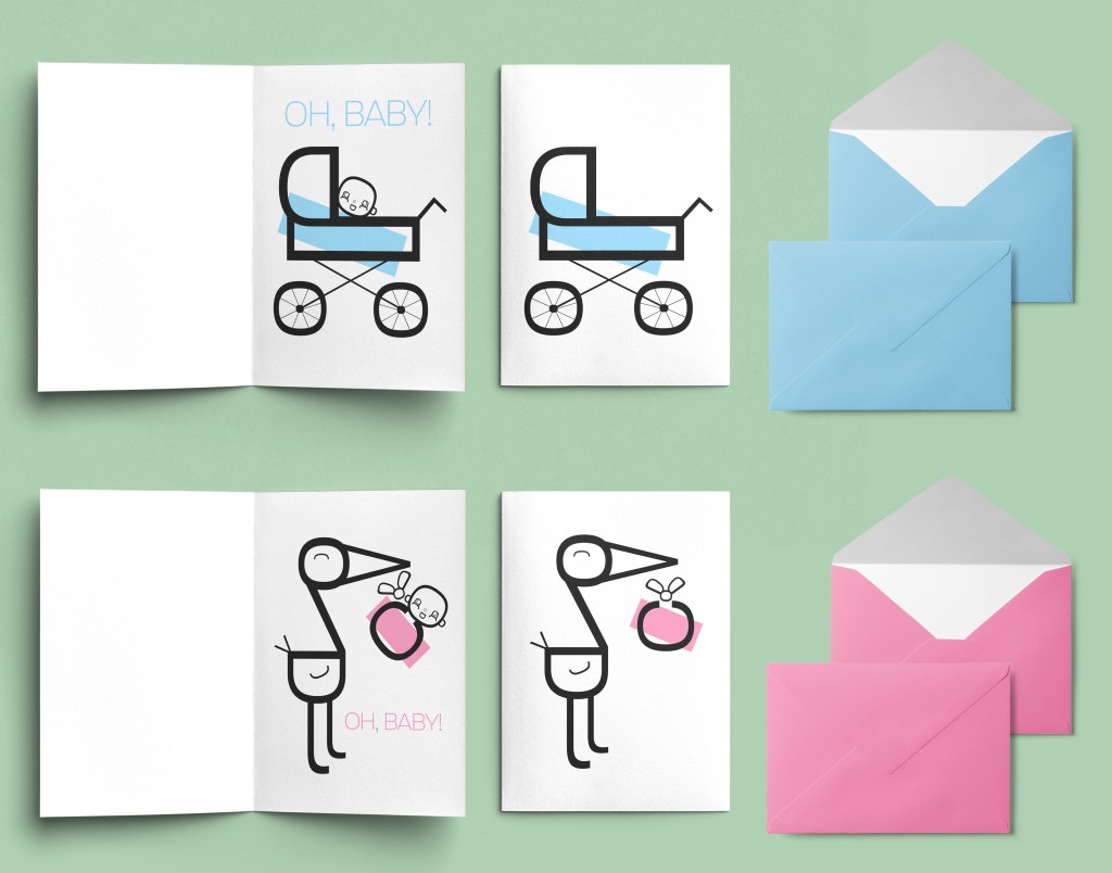
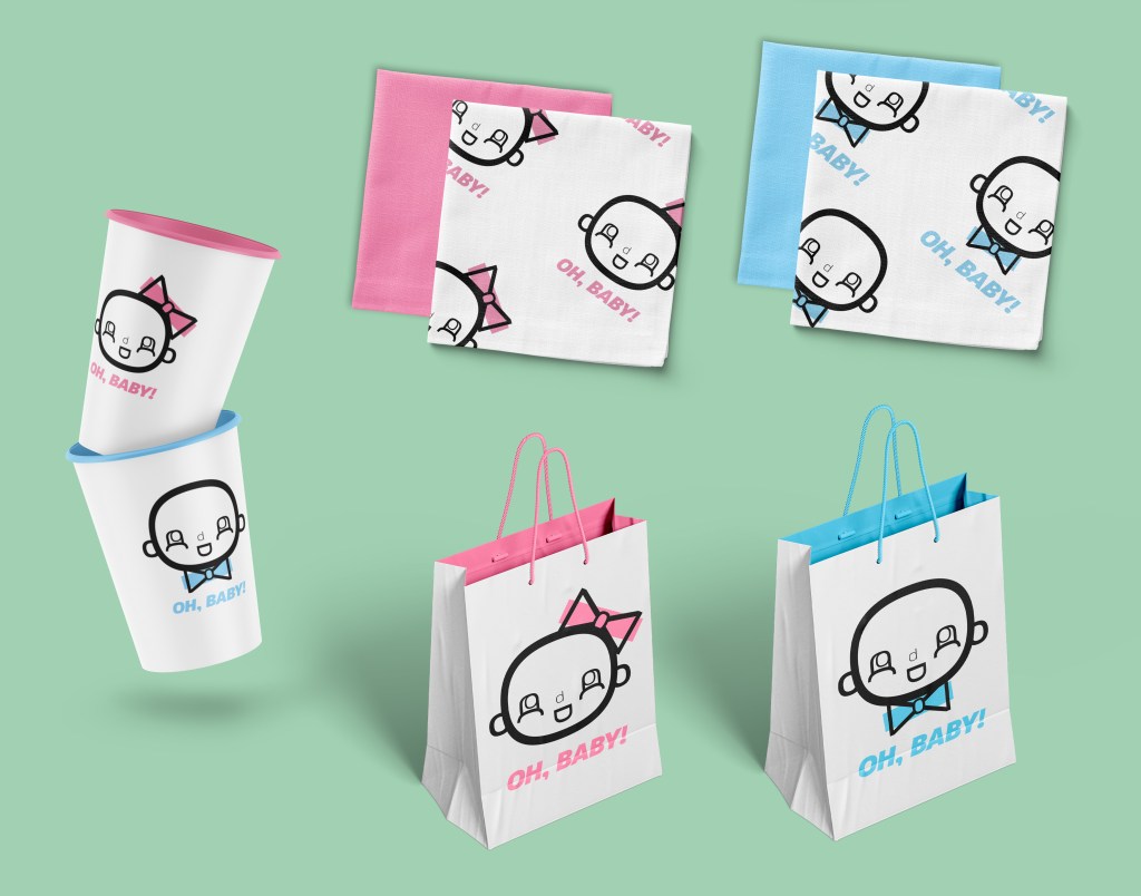
I’m at a point in my life where it seems as though everyone is having children. So many of my friends are trying to start their families, are currently pregnant, or have just welcomed their little one into the world. It’s a baby extravaganza over here.
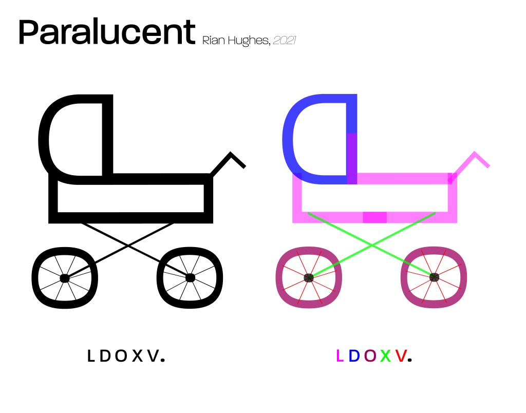
For Oh, Baby!, I wanted to challenge myself by limiting available tools. Everything in this project is made entirely out of Paralucent font, and none of the text is altered other than rotation; no stretching, no squashing.
Oh, Baby! was inspired by the style of United Productions of America. UPA utilized simple shapes and block colors that did not align with the drawing. The studio is *extremely* influential in American animation and its influence can be seen even today.


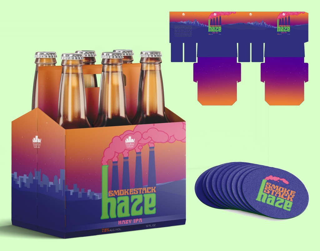
Dahntahn Brewin’ is an homage to Pittsburgh. The name is derived from “Pittsburghese” which is, to my understanding, something like a soft Boston mixed with an Appalachian accent.* Gs are dropped at the end of words (ie: brewin’ instead of brewing), rs are thrown in for fun (warsh, not wash), and I’m not sure how to explain this one but coat and home should not rhyme, but it does in Pittsburgh.
I love it.
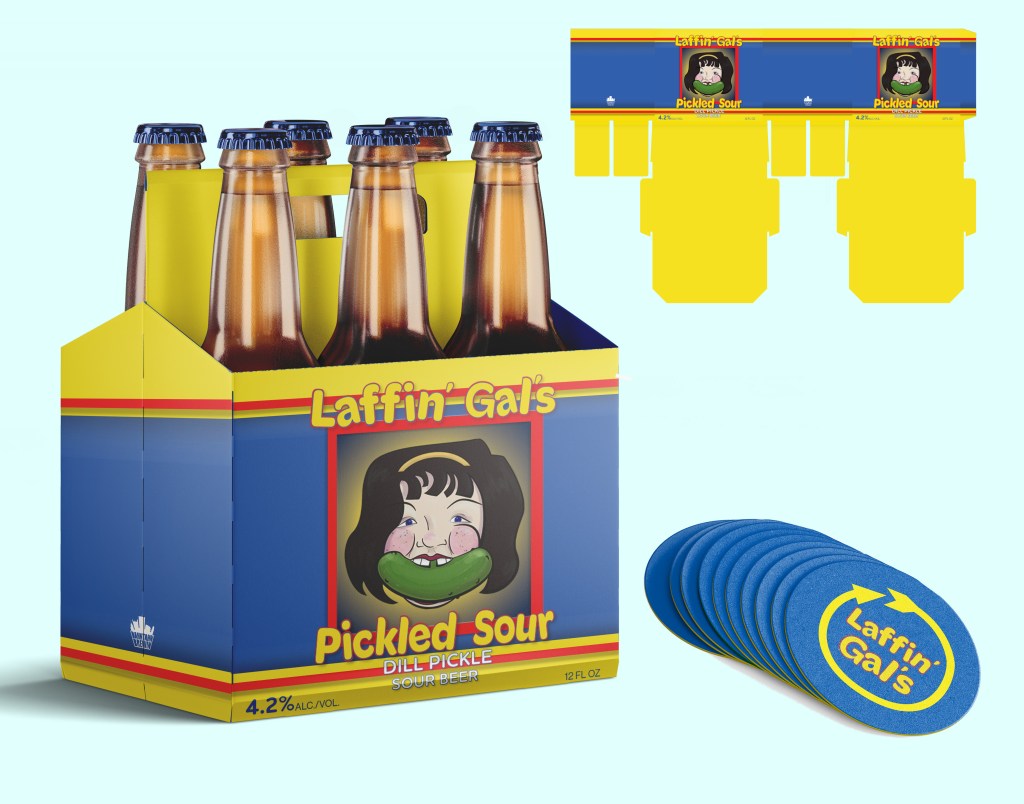
The brewery bases their drinks on local history and oddities, with the logo consisting of the most recognizable buildings in the city. Smokestack Haze is a nod to the city’s industrial history, and Laffin’ Gal is…is really something only locals would know.
Laffin’ Gal is based on the very real animatronic Laffin’ Sal, located in Kennywood. Laffin’ Sals (note: there are multiple spellings of laughing, laughin’, laffing, etc) were created during the 1930s and have many iterations. Some have curly red hair, others have brown wavy hair and, like Pittsburgh’s, straight-ish black hair. They all have rosy cheeks, huge laughing grins, and are very, very loud.
The bright yellow arrow is a representation of Sal’s home: Kennywood. Kennywood is Pittsburgh’s local theme park and its mascot is a giant yellow arrow that says “Kennywood”. It’s incredible.


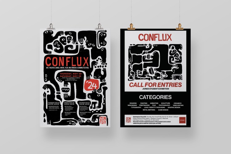
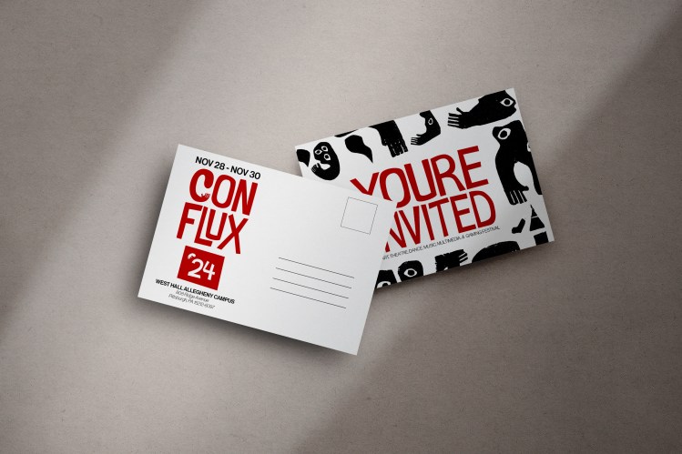
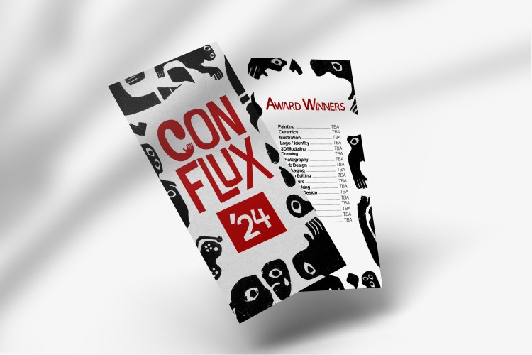
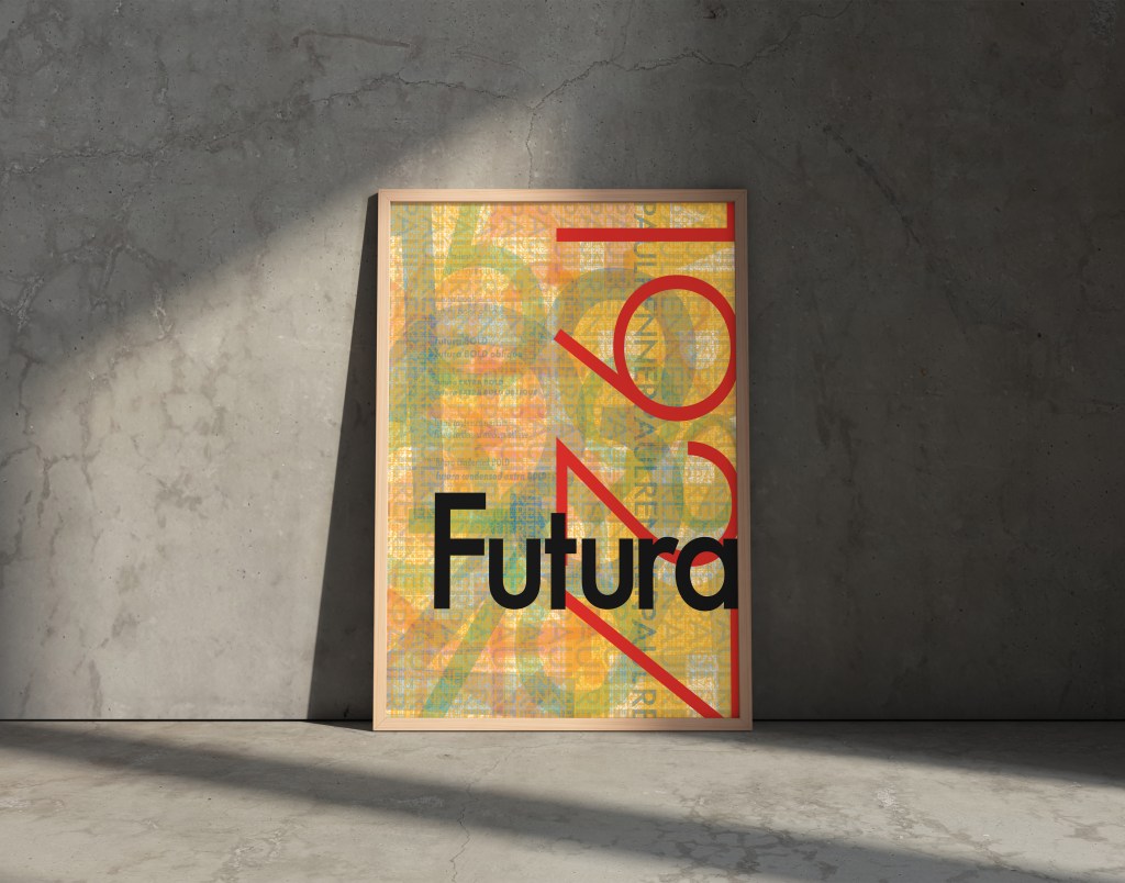
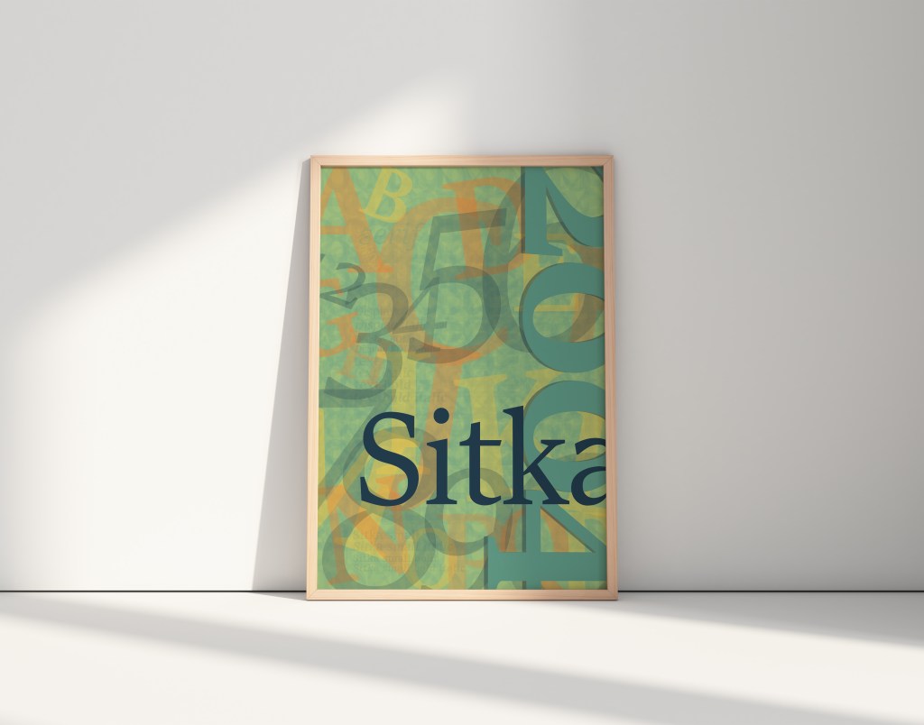
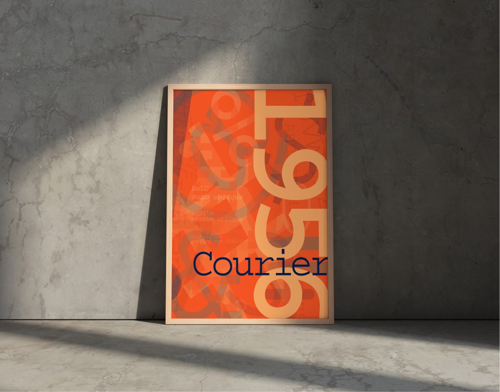
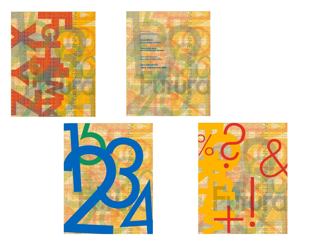
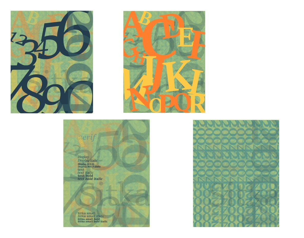
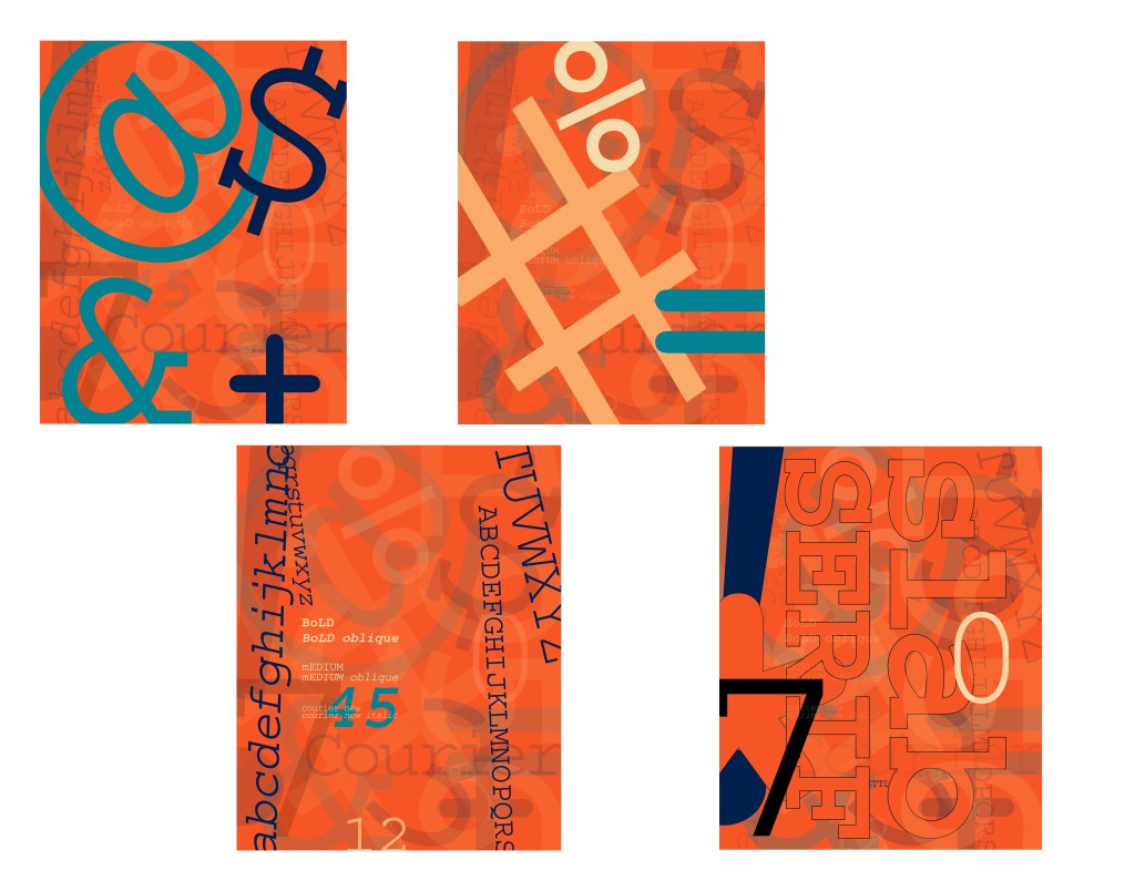
Each poster’s coloring was achieved with a thorough layering effect similar to painting. There are no color blocks. The solid colors seen are a result of dozens, if not hundreds, of layers resting atop one another. This was done to give them a textured look, and it also acts as a kind of magic eye. The more you stare, the more you see.
Below each poster are broken down versions to display some of these layers.
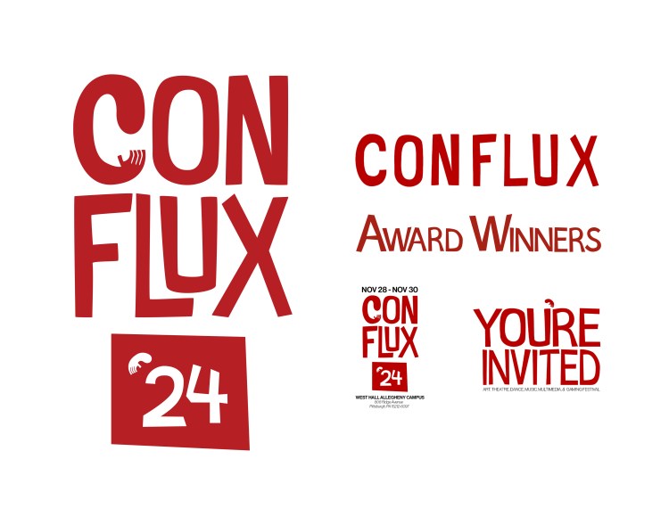
Conflux was a student competition. We worked in groups of 4-5 and created a whole campaign for an upcoming art festival.
The page on the top left is everything I made.
The art festival was to be held in Homestead, home to the infamous Homestead Riots. The campaign was to reflect the history of Homestead and Pittsburgh, and to also pay homage to steelworkers of the past and the artists of today.
My group made hands and protests the theme for the campaign. Like steelworkers, artists also work with their hands. Hands are also often used in protest signs, usually shown as a fist to show solidarity to whatever cause.
We wanted everything to have a handmade feel as well. The initial letters for the logo were cut out of red paper and then digitally manipulated. Screenprinting is also commonly used in protest. It’s a quick way to make signs. To continue with the theme of protest, the poster itself was screen printed and then edited to be black.